---
title: "Colour is the decision you pay for twice"
description: "Adding a colourway is nearly free in design and separately expensive in material, approval, component matching and lot-to-lot consistency, which is why launch palettes should stay narrow."
url: "https://surajmalstudio.com/insights/2026/08/colour-is-the-decision-you-pay-for-twice"
---
# Colour is the decision you pay for twice
13 min read Planning your collection Published 25 Aug 2026
Adding a colourway is nearly free in design and separately expensive in material, approval, component matching and lot-to-lot consistency, which is why launch palettes should stay narrow.
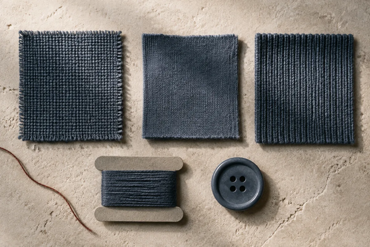
Illustration: woven cloth, jersey, rib, thread and a button in different blues. Review the complete component set together before approving colour.
Choose the launch palette at the moment the fabric is chosen, keep it small, and approve every shade on the cloth it will actually be dyed on. Colour looks like a design decision because it is made in a design tool. It behaves like a sourcing decision, because it is bought, dyed, matched and matched again long after the drawing is finished.
The distance between those two facts is where ranges quietly grow. Adding a shade to a line sheet takes a minute and no money, and nothing about [what the range costs to develop](https://surajmalstudio.com/guides/what-drives-development-cost) looks different on paper afterwards. Every commitment that follows the minute is separate.
## 01A colourway is a quantity of dyed material, not a line on a drawing
Consider what a colour is in production. In many programmes, colour is applied to yarn or cloth in a batch against a standard somebody has approved. Each colour in a range is therefore [its own quantity of material, ordered on its own terms](https://surajmalstudio.com/insights/2026/08/how-quantity-changes-what-is-possible), delivered on its own schedule and counted separately in stock. Two colours of one style are a single design and two material commitments.
Where in the process the colour is fixed decides how late it can change. Yarn dyeing puts the colour in before the cloth exists, which is why a stripe or a melange has to be settled at the earliest point and is the least reversible of the three. Piece dyeing holds undyed cloth and commits the colour once the fabric is woven or knitted, so the same greige can be split between shades later. Garment dyeing commits last of all, after the garment is sewn, and pays for that flexibility by restricting which threads, trims and constructions survive the process. A palette argued out without knowing which of those three the fabric is bought under is a palette whose real deadline is unknown.
On the selling side a colourway is a separate line for the whole of its life. It is forecast on its own, photographed on its own, picked and packed as its own set of sizes, counted on its own in every stock report, and marked down on its own terms at the end. The size curve does not divide between colours; it repeats inside each one. That is the multiplication that makes a palette a structural decision rather than a stylistic one.
## 02A lab dip approves a recipe on one substrate, under one stated light
Each commitment has to be approved before it exists. A lab dip is a small piece of the real fabric dyed to the target shade and submitted for judgement, usually as several attempts sitting either side of the target so there is something to choose between. It is assessed, corrected and resubmitted until it is right, and that cycle occupies calendar time sitting in front of bulk dyeing. Five colours means five of those conversations running to five verdicts, any of which can send a shade back for another attempt.
Signing one off commits more than a colour. It commits a recipe, on that fibre, in that construction, in that finish, and it turns the approved swatch into the object every later delivery is judged against. That physical swatch is the standard, so it has to be kept, dated and referenced rather than filed and forgotten, and a second copy has to sit with the dyer. Approving a shade from a printed reference or a screen leaves nothing to argue with when bulk arrives, because there is no agreed object in the room.
The substrate is central to that approval. Fibre, yarn, construction and surface finish change how a shade appears, so the same recipe need not produce the same visual result on two cloths. A knit is not automatically darker than a woven, nor is cotton always matte or polyester always lustrous. Blends can be dyed for a uniform or mixed appearance depending on the fibre and process. Review the intended construction and finish physically instead of predicting the result from the fibre name alone.
Two materials can also agree under one light and separate under another. It happens because the two are built from different colourants, and colourants that add up to the same appearance under one light source do not add up to the same appearance under a source with a different spectrum. A shell and a thread that are indivisible in a bright studio can split into blue and violet under shop downlights, or in daylight at the door, and neither one has changed. That is why colour is approved under agreed lighting rather than at whatever desk it arrives on, why the same agreed lighting is used at every stage from lab dip to bulk, and why a serious review looks at the match under more than one source before signing it.
## 03The colour has to be found again in every component, and thread is where it goes missing
The colour then has to be found again in every other component of the garment. Thread. Rib, collar and cuff. Binding and tape. A zip, its tape and its puller. Buttons. Woven and printed labels. A drawcord and its tips. Elastic. A lining or a pocket bag wherever it shows. Those components can use different fibres and materials, and colour behaves differently on cotton, on polyester, on a nylon tape and on a moulded button. A navy that is correct on the shell can arrive purple in the thread and green in the rib.
Thread is the one most often missed, and it is missed for three reasons that reinforce each other. It is chosen from a standing shade card rather than dyed to the garment, so matching means finding the nearest shade that already exists instead of making the one that is wanted. It is small and cheap, so it is frequently the last thing specified and often left to whoever is making the garment. And it is the component the customer sees most: topstitching runs the length of a placket, around a collar, down both sides of a seam and around every hem, so a thread half a step off the shell is on display along every edge, while a pocket bag that is wrong is seen once.
The other components each carry their own version of the problem. A zip is three matching questions inside one trim, because the tape is dyed textile, the chain is moulded or metal and the puller carries a plated or painted finish. Plating is not dyeing at all, so a metal trim is a decision about which family it belongs to rather than an exact match. A natural button varies from piece to piece by the nature of the material it is cut from. A woven label is made of dyed yarn and a printed one is pigment on tape, so the same brand colour behaves differently on each. Packaging moves further still: ink on board is a different process from dye on cloth, and deciding whether a swing tag is meant to match the garment or sit deliberately against it is better done on purpose than discovered on delivery.
The practical answer is to review the set rather than the shell. Bring the thread, the trims, the labels and the tag to the same table as the fabric, look at them assembled, and treat a deliberate contrast as a decision that gets recorded. A contrast that was chosen reads as intent. A near miss reads as a fault, and the customer has no way to tell which one was meant.
## 04Two deliveries of one approved colour are two batches
Then it has to match between fabric lots. Dyeing is a batch process and a second batch must be checked against the approved shade. Cloth can vary from selvedge to centre and along the length of a roll as well. Cutting rules exist for this: bundle by lot, keep one garment’s panels within one lot, and shade band the pieces so a sleeve and a body come from the same part of the run.
The variation is not carelessness, it is what a wet process does. The dyestuff itself arrives in batches, the water is not identical, and the temperature, the time, the ratio of liquor to cloth and the weight of fabric in the machine all move between runs. The process is built to land within a tolerance of the standard rather than on top of it. Inside one lot the same is true at a smaller scale: the edges of the cloth meet the dye differently from the middle, and the start of a run differs from the end.
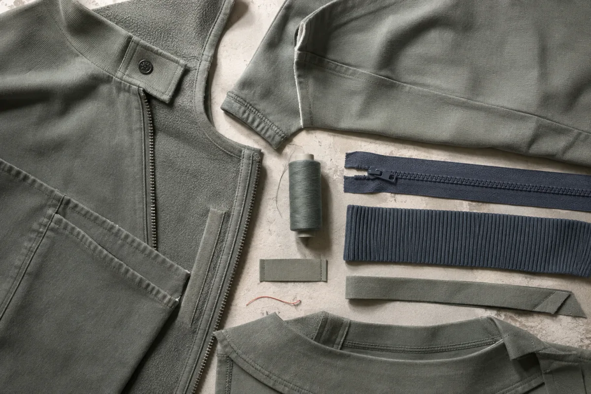
Illustration: blue zip tape and rib beside olive cloth. Decide whether the contrast is intentional before the components are ordered.
Colour deserves that care because of how it fails. A customer cannot see a seam allowance, a fusible bond or a fibre content that has drifted, and will not look. A sleeve half a step off the body is visible from across a room, by someone with no training, in about a second. It does not get read as a dyeing tolerance. It gets read as a cheap garment, and one panel can undo the argument the retail price was making.
[A repeat order](https://surajmalstudio.com/insights/2026/07/the-second-order-is-the-real-test)carries the same exposure. A colour that sold has to come back matching the photographs still on the site and the garment already in a customer’s wardrobe. When the new lot lands somewhere else, the options are to reshoot it, to sell it as a separate shade, or to ship a mismatch to people who have seen the original. The fourth option is the one the approval process exists to create: hold the original physical standard, judge the new lot against it, and reject what falls outside. That only works if the standard was a real object in the first place, which is the whole argument for keeping the approved dip. It also means the shades intended to repeat deserve a tighter tolerance than a shade bought once for a season, and that decision is better taken before the first order than after the second delivery.
## 05One extra colourway on one style, followed to the end
Take a brand launching one shirt in one colour and adding a second. The design work is a minute. The lab dip cycle runs again, in parallel if the calendar is kind and in series if the first shade needs a resubmission, and the fabric order now splits into two dye lots that are unlikely to finish together. If both shades must launch together, the style can only ship when the later of the two lots is delivered, so the launch date is now set by the second colour rather than the first.
The components follow. Thread in two shades, which means either two standing shades approved against two shells or one compromise that is a little wrong on both. Buttons either doubled or chosen as a neutral that works with each, which is a design decision made under pressure from the supply chain rather than from the drawing. The label, if it carries a colour, is now a decision about whether it matches either shirt. In the cutting room the marker is laid twice, the cloth is spread twice, and the bundles have to be kept apart from each other and from their own lots.
Then it reaches stock, which is where the arithmetic bites. [The number of lines doubles, each carrying the full size curve](https://surajmalstudio.com/insights/2026/07/the-most-expensive-decision), while the planned total demand and buy remain unchanged in this example. Cover per size is therefore thinner in both colours. The style sells out of the middle sizes in the colour that is working, while the same middle sizes sit unsold in the colour that is not, and the stock report shows the style as available throughout. On the site the second colour needs its own photographs, on the same body under the same light, or the two colourways read as two different garments. A share of customers order both to compare and send one back. At the end of the season one colour has sold through and the other is the markdown, and the margin the first colour earned is what pays for it.
The observable symptom, months later, is a range that looked broad on the line sheet and is thin in every size that matters, and a reorder that cannot be funded because the cash is sitting inside the colour that did not sell. It rarely gets diagnosed as a palette decision, because the palette decision was the one that felt free.
## 06A narrow palette behaves better in the stockroom and reads as a decision
So the palette is a commercial structure. Its size multiplies against sizes on the selling side and against components on the supply side, and it does both at the same time.
[A deliberately narrow launch palette](https://surajmalstudio.com/insights/2026/07/against-launching-with-everything) is the practical answer. Give most of the range to a small group of anchors that style together and can repeat, and let one colour carry the point of view. That one can be the difficult shade, saturated or deep, because it is doing real work and it is a single approval chain. Colours added because the palette felt thin are usually the ones that sit through the season and come back at a discount.
Decide each shade against the material it will live on. A screen shows emitted light on a flat plane at full saturation. Cloth shows reflected light across a surface with texture, weight and a finish, and each of those moves the colour. One dye recipe reads differently on a matte woven, a brushed knit and a washed twill. Deep blacks, clean whites and strong reds are among the hardest to hold consistent, and they are the shades most often picked from an image.
[In the order they have to happen](https://surajmalstudio.com/insights/2026/06/the-decision-sequence-of-a-product), then. Settle the cloth before the palette, because the palette is a property of that cloth and not of the drawing. Choose the anchors as a group, on the basis that they have to be wearable together and photograph as a set. For a compact first range, consider giving one shade the job of carrying the point of view. Approve on the real substrate, in the real construction, under agreed light, with the components in the same review rather than after it, and keep the approved standard as a physical object. Decide, before the first order, which shades are meant to repeat, because that is what sets the tolerance they will be judged against.
The second-order effect is the reason to bother. A small palette makes every later decision cheaper: the shoot is one session with one lighting setup, the site reads as one range rather than a supplier list, restocking concentrates money in shades with a track record, and the brand becomes recognisable from across a shop floor because it always looks like itself. Breadth of colour, from a distance, looks like stock. Edit looks like a decision.
## 07Where breadth of colour is the product
The argument inverts when colour is the proposition. A basics label whose whole offer is one well-made T-shirt in a wall of shades, or a knitwear brand built on a colour library, is selling the palette itself, and cutting it would be cutting the product. Those operations are worth looking at closely, because of what they have that a first range does not. They run on one or two blocks and usually one cloth, so the garment is a constant and colour is the only variable. The library is a standing asset carried year after year rather than a seasonal decision, so a lot that lands slightly off can be absorbed into a continuing standard instead of orphaning a season. And the styling risk is close to zero, because a simple garment in an unusual shade is still a simple garment. Colour breadth is a business built on repetition, which makes it a poor way to begin one.
The strongest objection is that customers want choice, and it is a real objection. A shopper who arrives at a page offering one colour has a genuine chance of finding that the one colour is not theirs, and a second option converts some of those visits. Choice is not a vanity; it is a mechanism.
The answer is that the choice a customer experiences is not the choice on the line sheet. What is available to a shopper is what is in stock in their size, on the day they look. A range spread across many colours with thin cover in each offers that person fewer real options than a short palette held with depth, because the colours they can actually buy are the ones the size curve still supports. The hierarchy also runs the other way from the way it is usually planned: someone who cannot get their size leaves, while someone who cannot get their third-favourite colour generally buys their first. Visible breadth and available breadth are different quantities, and only one of them is being shopped.
The direction of travel settles it. A colour can be added to a style that has already proved it sells, on evidence, with the fabric already approved and the components already matched. An unsuccessful colour may need clearance, a later selling window or another use for uncut cloth; each has a cost. Growing from demand evidence makes the next commitment easier to justify. Reducing a palette after production means deciding what happens to the stock.
Your next step
Put this into practice for your collection.
[Talk about your idea](https://surajmalstudio.com/enquire)
## Read next
### [The most expensive decision is not the fabric](https://surajmalstudio.com/insights/2026/07/the-most-expensive-decision)
It is not the fabric. It is the number of styles, and the reason is not obvious.
### [The order product decisions have to happen in](https://surajmalstudio.com/insights/2026/06/the-decision-sequence-of-a-product)
Purpose must settle before silhouette, material and construction if later choices are to preserve room for the decisions that matter.
### [Against the category specialist](https://surajmalstudio.com/insights/2026/08/against-the-category-specialist)
Working across categories keeps a studio's solutions moving, because a construction learned in one solves a problem in another; specialism buys depth and narrows the reference set.
### [Choosing fabric for a first collection](https://surajmalstudio.com/guides/choosing-fabric-for-a-first-collection)
Choose fabric before finalising the styles because its structure and finish determine how the clothes hang, which maker can sew them, and the quantities and costs involved.
Read next [The most expensive decision is not the fabric 4 min read · Planning your collection](https://surajmalstudio.com/insights/2026/07/the-most-expensive-decision) [The order product decisions have to happen in 4 min read · Planning your collection](https://surajmalstudio.com/insights/2026/06/the-decision-sequence-of-a-product) [Against the category specialist 11 min read · Planning your collection](https://surajmalstudio.com/insights/2026/08/against-the-category-specialist) [Choosing fabric for a first collection 7 min read · Planning your collection](https://surajmalstudio.com/guides/choosing-fabric-for-a-first-collection)
---
[View this page on the website](https://surajmalstudio.com/insights/2026/08/colour-is-the-decision-you-pay-for-twice)