A visual system that survives contact with a garment
Labels, tags, cartons and shopfronts reveal whether the identity is a system or only a screen presentation.
On this page 5 sections

01Test the identity beyond a screen
On a woven label, a clothing identity loses the effects that made it convincing on screen. It is resolved when the same system remains recognisable on a woven label, a care label, a swing tag, a carton and a shopfront. Those surfaces remove effects, change scale and introduce information the presentation mock-up can avoid.
Screens are unusually forgiving. They can supply light, perfect colour, motion, generous space and a clean background. A mark can depend on a delicate line or a subtle contrast and still appear precise. Cloth, paper, adhesive, ink and thread interpret the same decisions differently. The identity needs rules for those changes before each supplier or application invents a local solution.
02Start with garment labels and tags
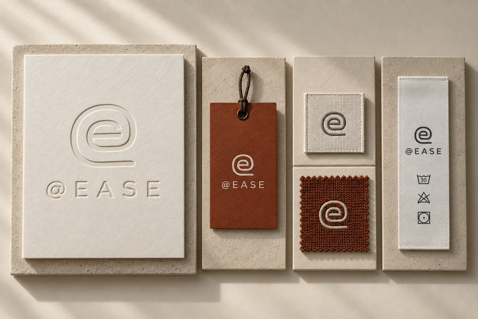
The woven label is the first compression test. Place the wordmark at the size the garment can comfortably carry, in the colours and weave likely to be used. Check whether counters close, letter spacing disappears or the edge of the label competes with the mark. A simplified form may be necessary, but simplification should reveal the same identity rather than introduce an unrelated badge for small spaces.
Context matters as much as reproduction. A neck label sits against colour, texture, seams and the shape of the opening. It may be partly covered when worn and viewed briefly when handled. Test it inside pale, dark, patterned and textured garments if the collection will include them. The system should define when the label recedes, when it contrasts and which relationship feels consistent with the brand.
The care label tests hierarchy rather than display. It has to carry dense, practical information in a narrow format and remain readable after handling. The brand name, information structure and typographic voice should still feel intentional without obstructing the label's purpose. An identity that only works through large headlines has not yet developed a voice for necessary, ordinary language.
A swing tag introduces sequence. It may need to identify the brand, carry product or commercial information and direct the customer elsewhere without becoming a stack of competing messages. Test the tag while attached to a garment, not floating on a neutral artboard. Its weight, colour, finish and attachment become part of the product before they become waste, so ceremony should be justified by a clear role.
03Check packaging, signs and colour
Packaging tests restraint under interference. A carton collects tape, shipping labels, handling marks and retailer instructions. Place those real interruptions over the proposed system. Check whether the brand remains identifiable when pristine areas disappear and whether required information has somewhere orderly to go. The best carton application may be quieter than the campaign, provided it still belongs to the same visual grammar.
The shopfront reverses the scale problem. A mark that feels balanced in a browser header may become weak across glass, while a symbol designed for distant recognition may overwhelm a garment label. Test the identity at viewing distance, among neighbouring signs and across changing daylight. Scale variants are useful when they preserve proportion and character instead of stretching a single file until it behaves badly.
Colour should be examined as a relationship, not a fixed screen value. The palette will meet dyed cloth, uncoated paper, coated stock, thread, paint and illuminated displays. Exact sameness may be impossible or undesirable across those materials. Define which contrast, temperature and hierarchy must survive. Then allow each medium to reach that relationship through an appropriate expression.
The same test applies without colour. Reproduce the system in a single ink, as a woven contrast and as a plain text mark. Remove photography and motion. If recognition disappears, identify what was carrying it: perhaps a colour pair, image treatment or transition rather than the mark itself. Those elements can remain part of the identity, but the physical applications need another shared cue.
04Make small text and real applications readable
Typography has to survive both display and instruction. Product names, fibre and care information, an address, a shop sign and a campaign line place different demands on the type system. Set real content before approval. Placeholder words conceal awkward lengths, punctuation and hierarchy. A useful family gives the brand a consistent manner while allowing necessary information to become quiet and clear.
05Review the applications before sign-off
Build an application proof rather than a collection of ideal mock-ups. Use the likely materials, production methods, content and constraints. Fold the label, attach the tag, cover part of the carton and place the sign in a visual neighbourhood. Review what fails first. The failure reveals whether the system needs a stronger mark, clearer hierarchy, fewer dependencies or better rules for adaptation.
These tests should happen before sign-off because they can change the centre of the identity. Discovering that the wordmark cannot hold at garment scale is not a minor production adjustment. Discovering that the palette loses its hierarchy on cloth may alter the collection interface. Physical proof lets those findings improve the system while it is still a design, not an asset library already in circulation.
We would approve the visual system only when its variations feel governed rather than improvised. The screen, label, tag, carton and shopfront do not need to look identical. They need to make the same character recognisable under different conditions.
An identity is finished when the garment can carry it without explanation.